
MAPPED
ABOUT
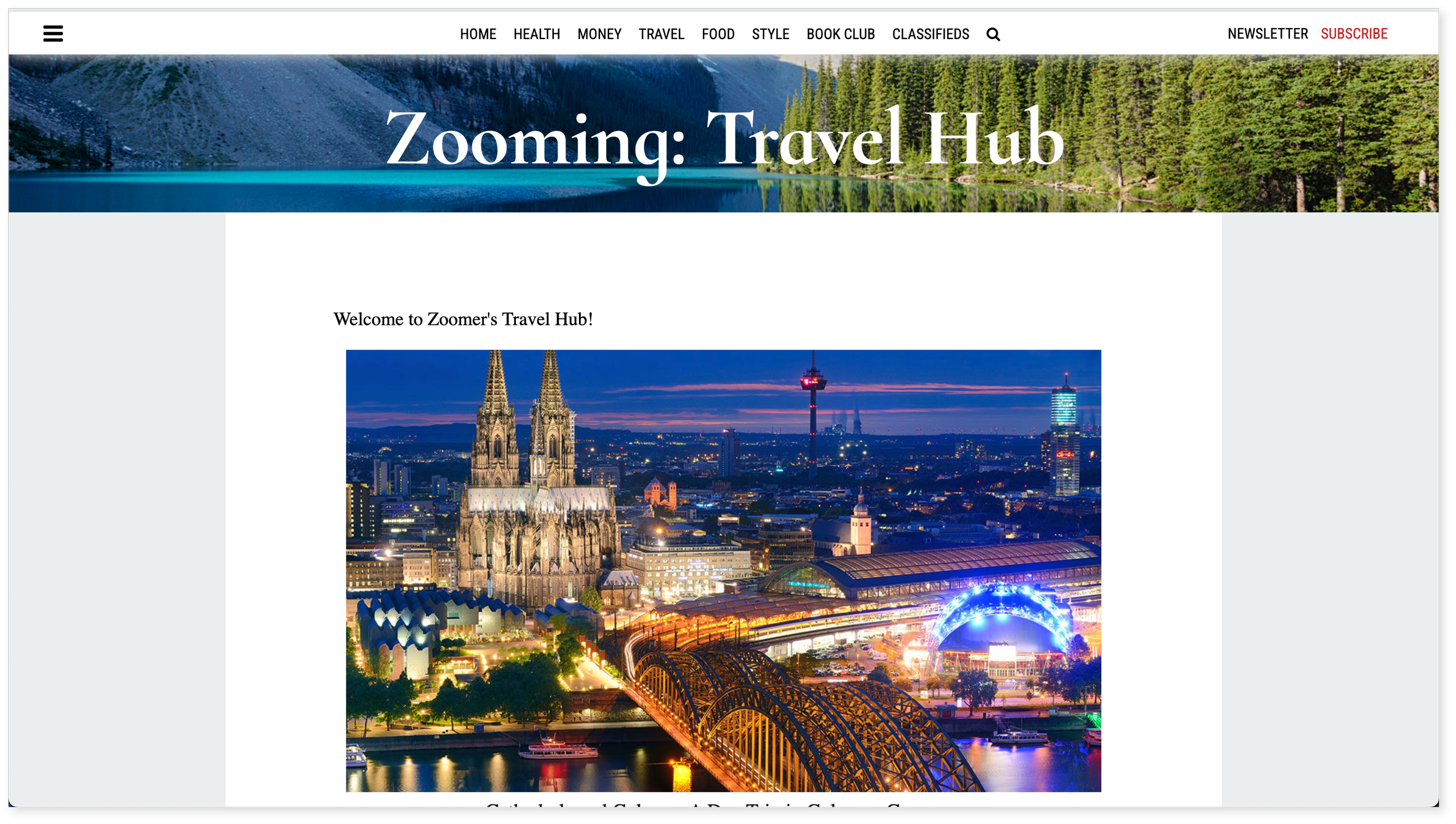
Mapped is Everything Zoomer's travel section, offering users the opportunity to explore trending destinations and book world-class vacations.

CHALLENGE
Everything Zoomer, a cornerstone of the Zoomer Digital Network, underwent a significant redesign to uphold a high-end appeal among Zoomer's recently acquired brands like Daily Hive, blogTO, and the Peak. The focus was on enhancing user experience, especially in navigation and mobile optimization, beginning with the travel section (Mapped).
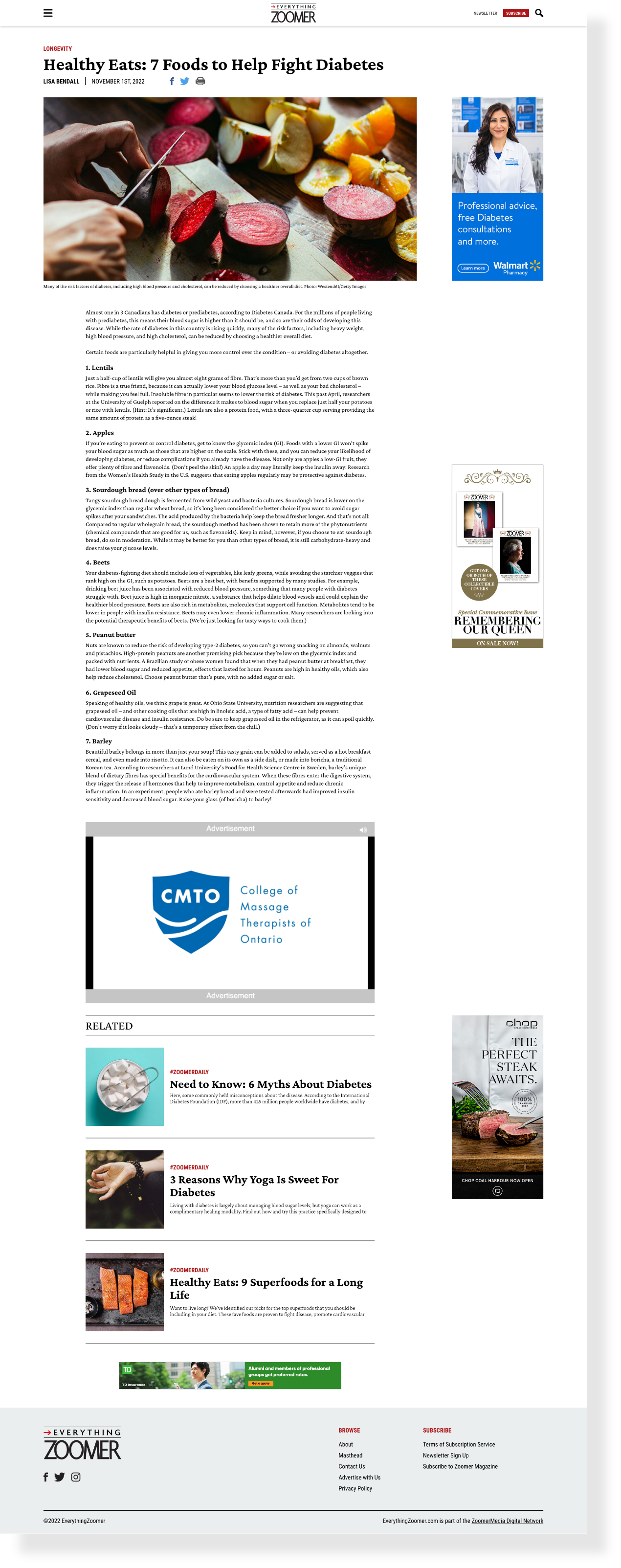
Original designs before project initiation.


A jarring mobile and tablet experience for users as a result of broken scroll sections and confusing navigation.
Desktop offers an opportunity for higher-impact design, leveraging upgraded photography and a layout that effectively utilizes negative space.
APPROACH
The project began with the product team identifying a need for a redesign due to the recent additions of blogTO, Daily Hive, and the Peak. Additionally, the site struggled on mobile and tablet devices, which was problematic as 75% of our users accessed the site through these platforms. We presented the identified opportunities to the Everything Zoomer stakeholders, who agreed to launch a redesign project.
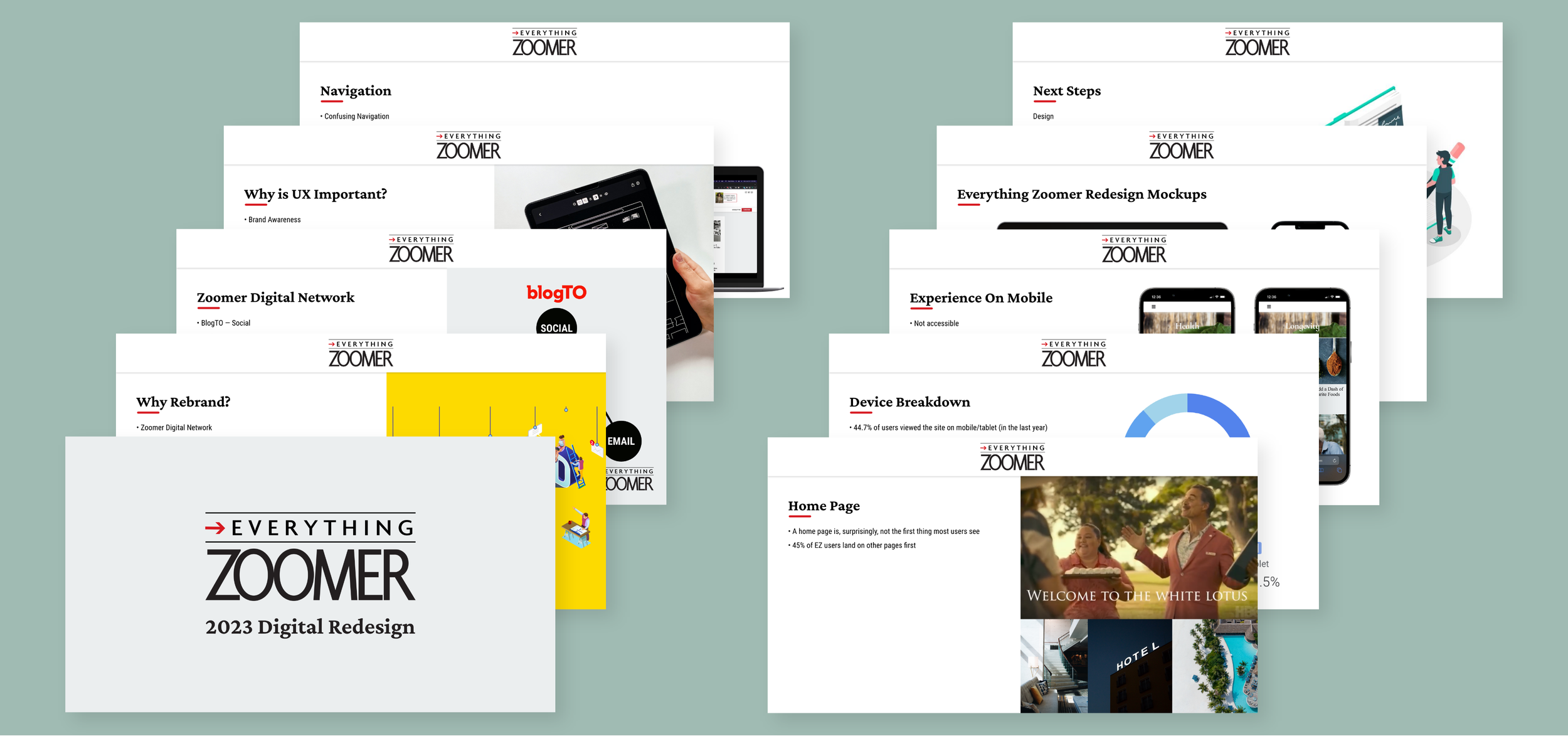
Preview of slides from the redesign presentation
INSPIRATION
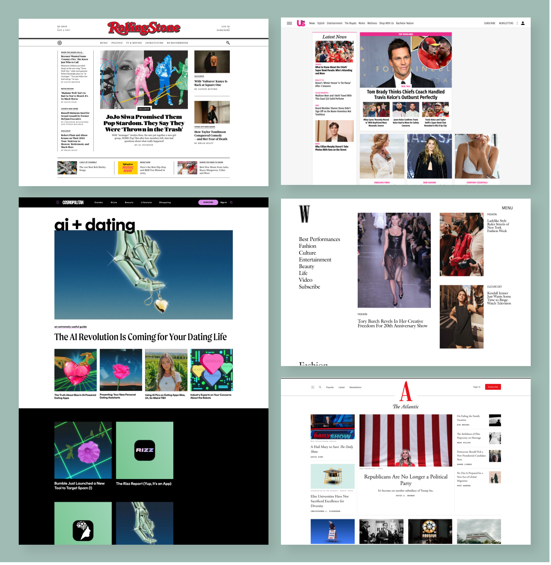
Before the redesign, a review was conducted to examine similar brands that the target audience might be familiar with. Given that Everything Zoomer's content comes from Zoomer Magazine, I explored various magazine brands for inspiration.

GREYSCALE
Subsequently, the process with greyscale wireframes was initiated. A key challenge with the site was suboptimal user navigation, prompting a need to dedicate ample time to refining functionality and site flow. I prioritized mobile and tablet designs due to the significant user traffic on these devices compared to desktop.


HI - FIEDLITY
After the site's functionality and flow were approved, hi-fidelity designs were initiated. The Everything Zoomer team was uncertain about the content they wished to feature. Existing content was reviewed to formulate a recommendation on how to populate the site
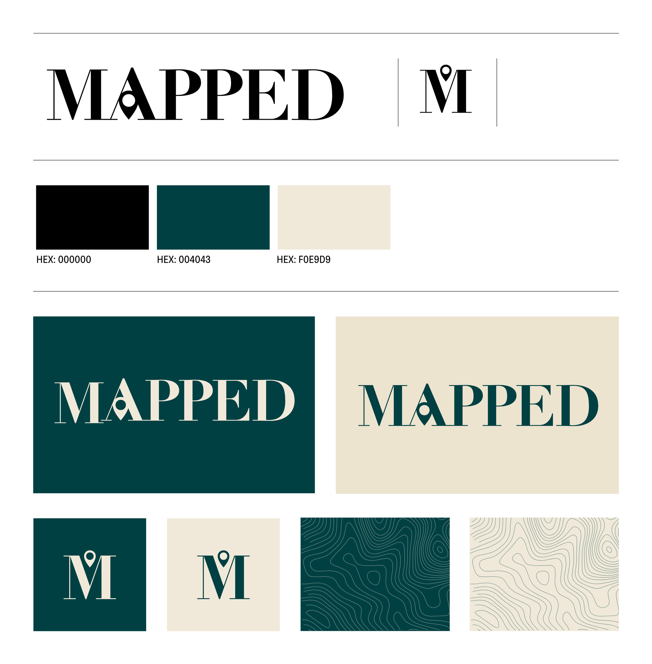
BRANDING
Collaboration took place with Everything Zoomer's Brand Director to implement a new name and brand guidelines for the site.
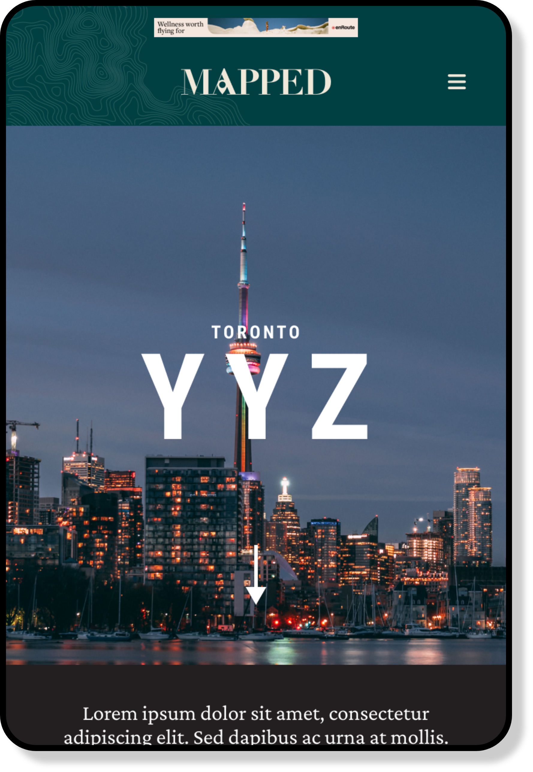
MOBILE & TABLET OPTIMIZATION
Designs were created for mobile and tablet first, recognizing that the majority of the demographic prefer these devices. Key optimizations encompassed responsive design, touch-friendly navigation, and content prioritization.
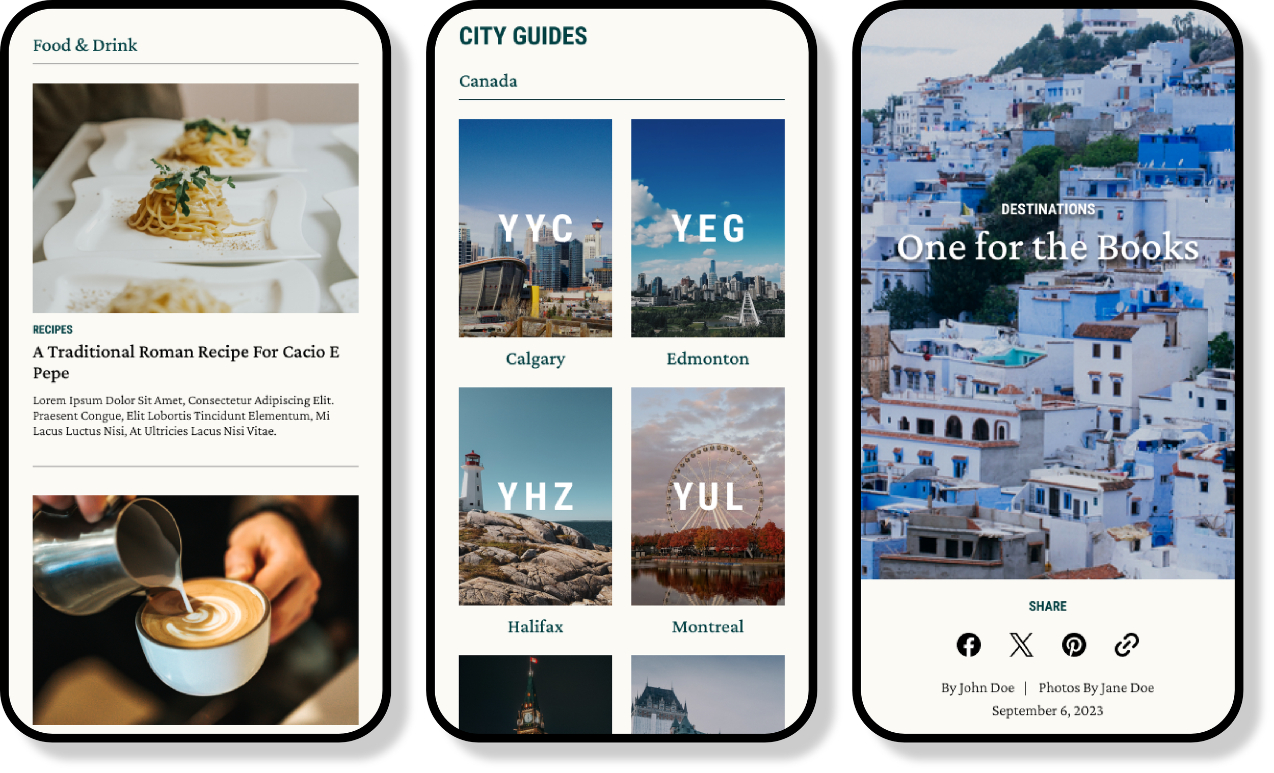

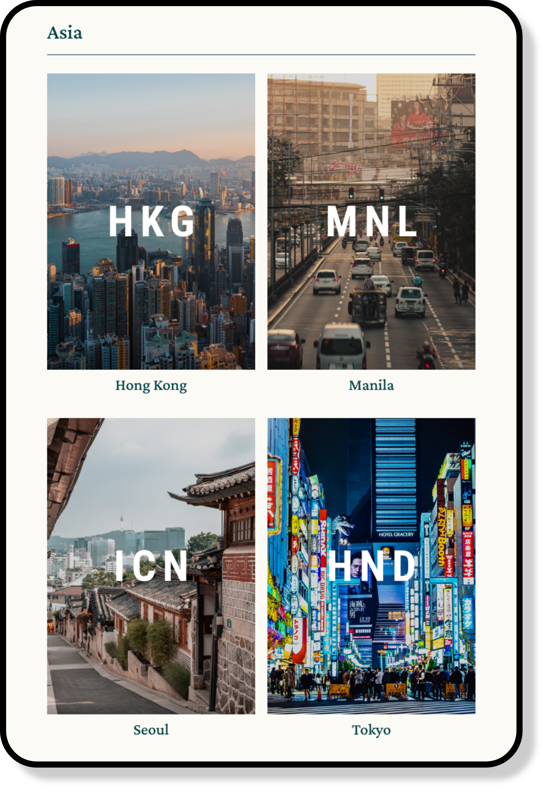
CITY GUIDES
A significant portion of the content focused on city-level travel destinations. I proposed the creation of city guide pages to comprehensively consolidate this content.


CATEGORIES
To enhance content organization beyond city-level interest, category sections such as Food & Drink and Experiences were incorporated into the home page.
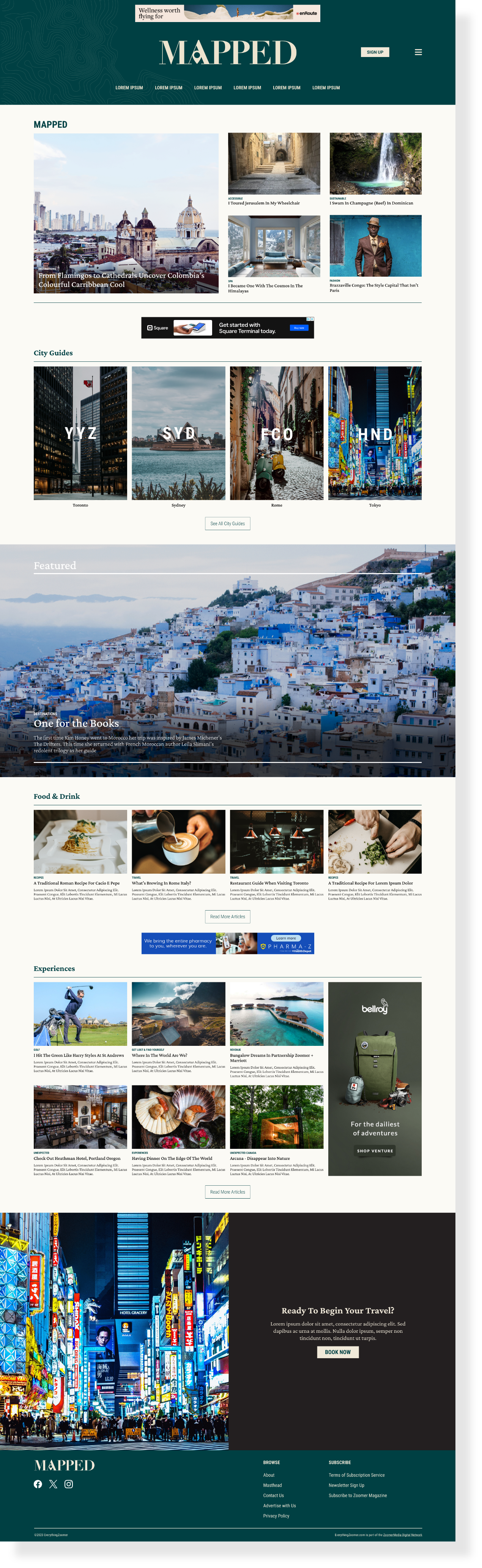
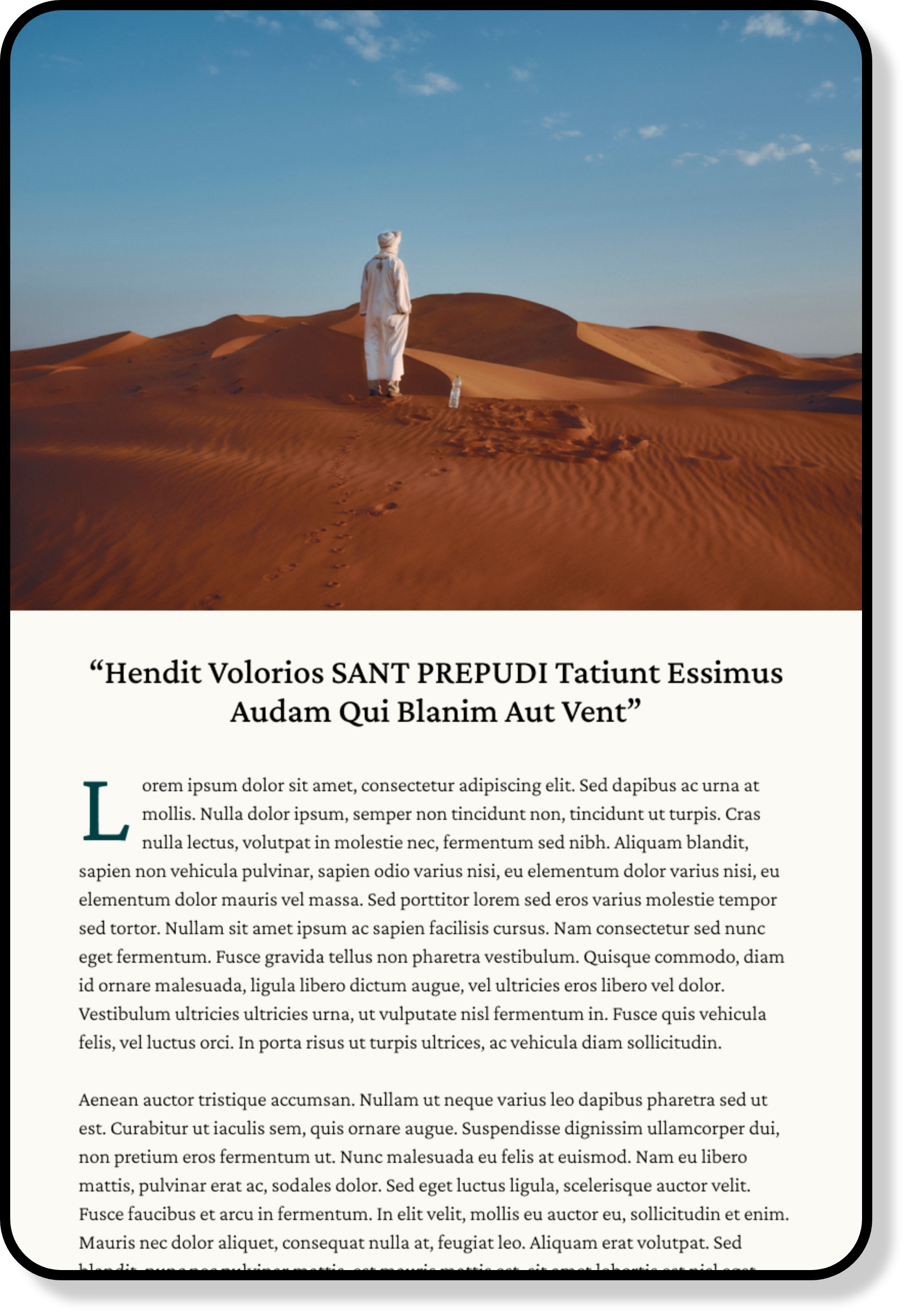
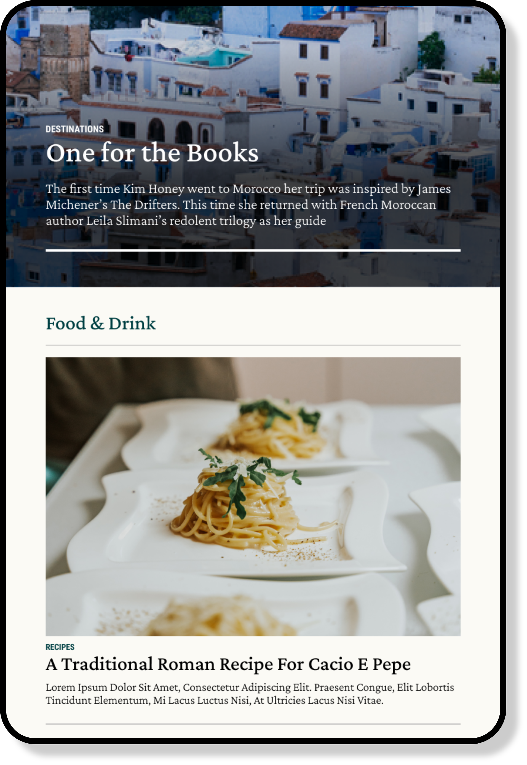
FEATURED ARTICLES
The magazine's use of large, striking imagery for its prominent articles inspired me to replicate this feature on the website. This was achieved through full-screen banners, incorporating parallax effects, varied image sizes, and layouts to emulate the brand's use of collages.
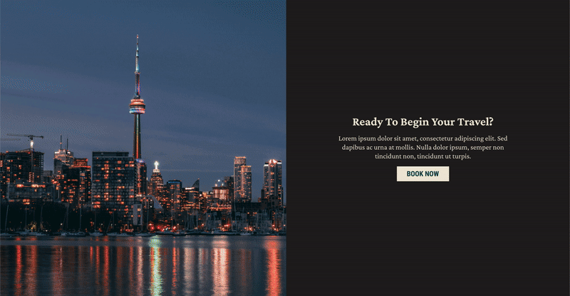
CTA BANNERS
Ultimately, the site's goal is to direct users to the Mapped third-party booking site. I employed rotating gif banners with impactful photography to drive traffic.
RESULTS & TAKEAWAYS
After presenting the final redesign, the stakeholders provided such positive feedback that they requested an extension of these designs to the remainder of the Everything Zoomer site. We are currently in the process of ideating designs, here are some samples from our work thus far.