
LISTED
ABOUT
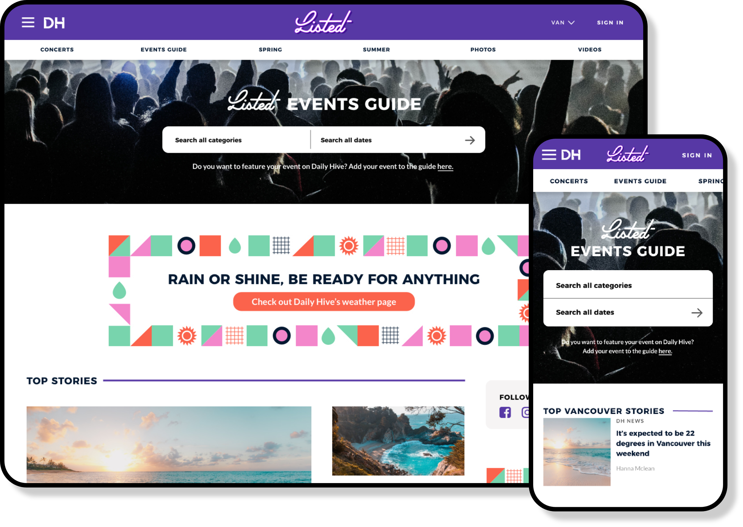
Listed is a subsidiary brand of Daily Hive, providing users with the ability to browse, create, and promote local events.

CHALLENGE
Daily Hive launched an MVP version of Listed; however, it was not optimized for UX. The focus was on ensuring the redesign was intuitive for users to effectively browse local events and create postings.
HEURISTIC EVALUATION
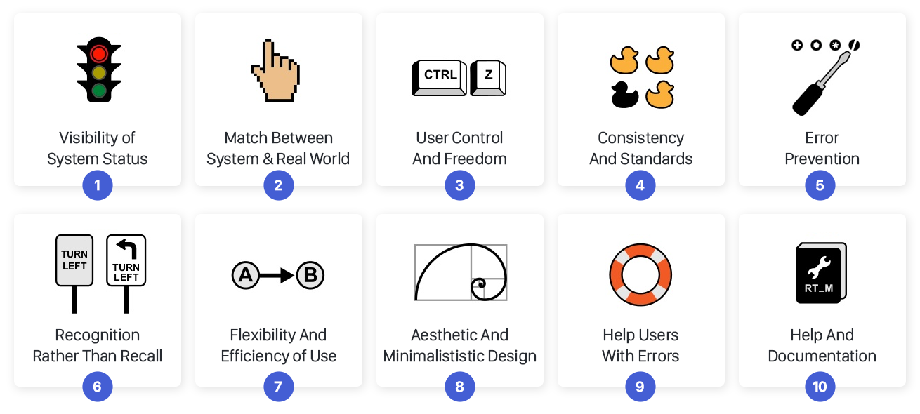
After meeting with stakeholders from Daily Hive and understanding the goals and pain points of the site, I conducted a heuristic evaluation to identify design issues. Heuristic evaluation identifies design problems in a user interface using guidelines called heuristics, which gauge user experience quality. Of the 10 heuristics for interactive design, I'll focus on the key findings from the Listed evaluation.
FINDINGS
The key heuristics I identified during my evaluation, demonstrating their impact on the user's experience.
#3: USER CONTROL & FREEDOM
“Users may accidentally activate functions and need a clear 'emergency exit' to leave the unwanted state quickly, like redo or undo features.” - Nielsen Norman Group
FINDINGS:
There is a lack of back buttons throughout the site especially on the form for creating an event (1). In addition, there isn’t a status bar or any way to showcase to the user what page they’re on in the form (2). The back button should allow a user to easily navigate throughout the form and should not act as a cancel button. To make it clear to the user there should also be a cancel button throughout the form to allow a user to clearly make an “emergency exit.” (3)

#4: CONSISTENCY & STANDARDS
“Users should not have to wonder whether different words, situations, or actions mean the same thing. Follow platform conventions.” - Nielsen Norman Group
FINDINGS:
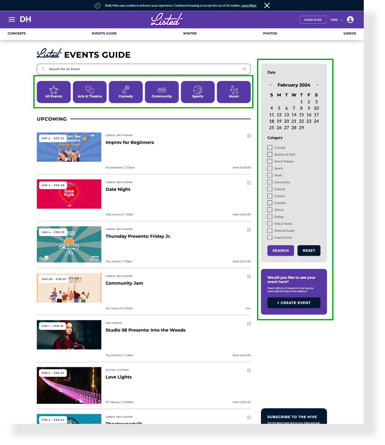
The search bar at the top of the events guide should be consistent across the site. The search bar on Daily Hive's site allows users to search by typing keywords, whereas the events guide search bar uses toggle options for categories and dates. To maintain a simple layout and reduce the learning curve for users, the search bar should function similarly to other websites.

#6: RECOGNITION RATHER THAN RECALL
“Reduce the user's memory load by keeping objects, actions, and options visible. Users shouldn't have to remember information from one part of the dialogue to another. Instructions should be visible or easily retrievable when needed.” - Nielsen Norman Group
FINDINGS:
The Events Guide also struggled with adding customized filters and categories to facilitate user searches. Additionally, it had a search bar within it, leading to confusion among users regarding which search bar to use when looking for an event.
#9: HELP USERS RECOGNIZE, DIAGNOSE & RECOVER FROM ERRORS
“Error messages should be clear, avoiding error codes, and accurately describe the problem while offering a constructive solution.” - Nielsen Norman Group
FINDINGS:
I observed that when filling out the create event form, it was possible to complete sections without entering correct information. Additionally, there were no prompts to inform users if information was not entered properly.

DESIGN DECISIONS
The key findings from the heuristic evaluation indicated that the Events Guide required a simplified search section, a comprehensive filter/category section for quick searches, and a form with error prompts, navigation buttons, status cues, and a cancel option.
RESEARCH
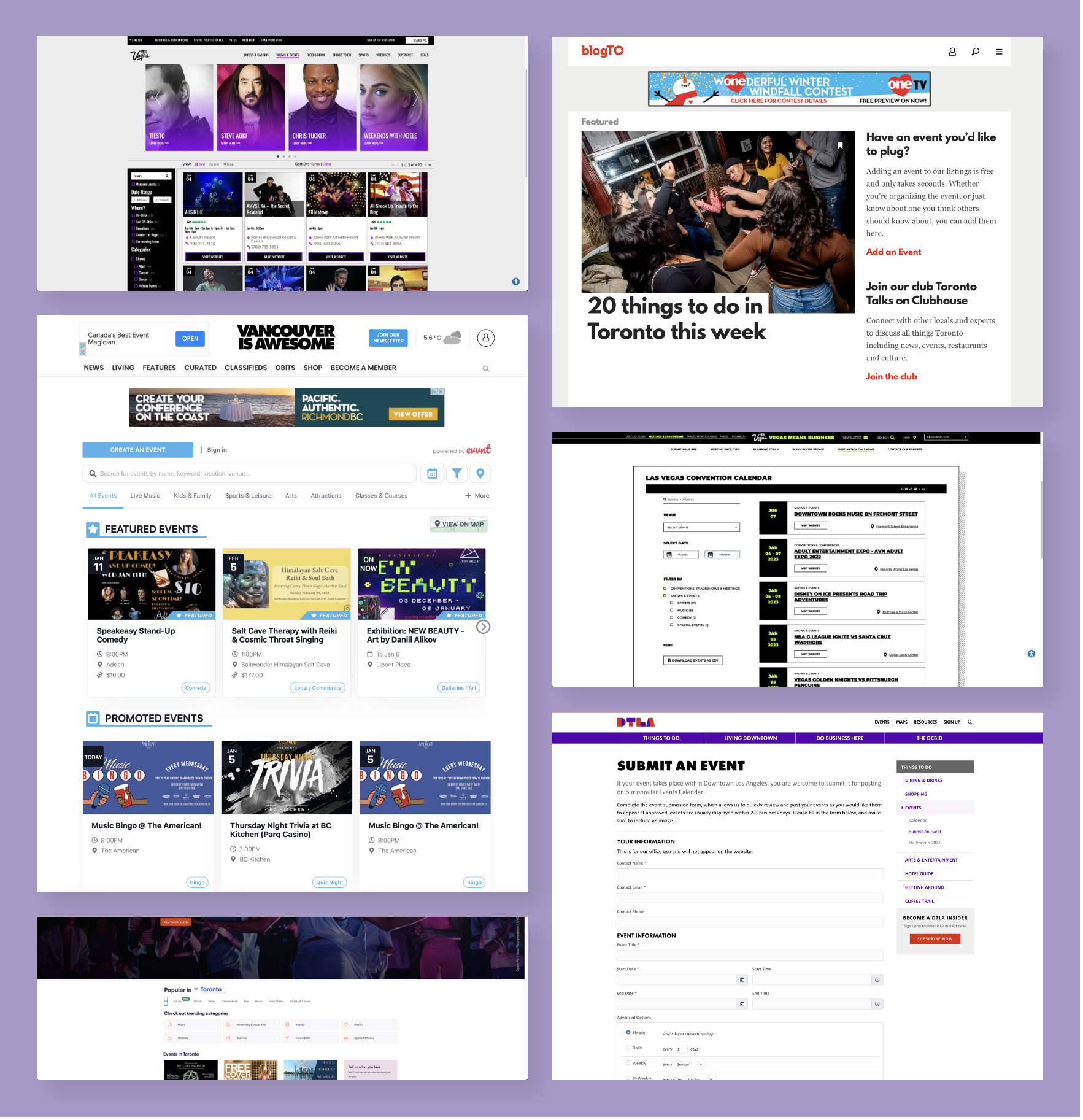
Before embarking on the redesign of Listed, I conducted research on event-based websites to understand user expectations and interactions.

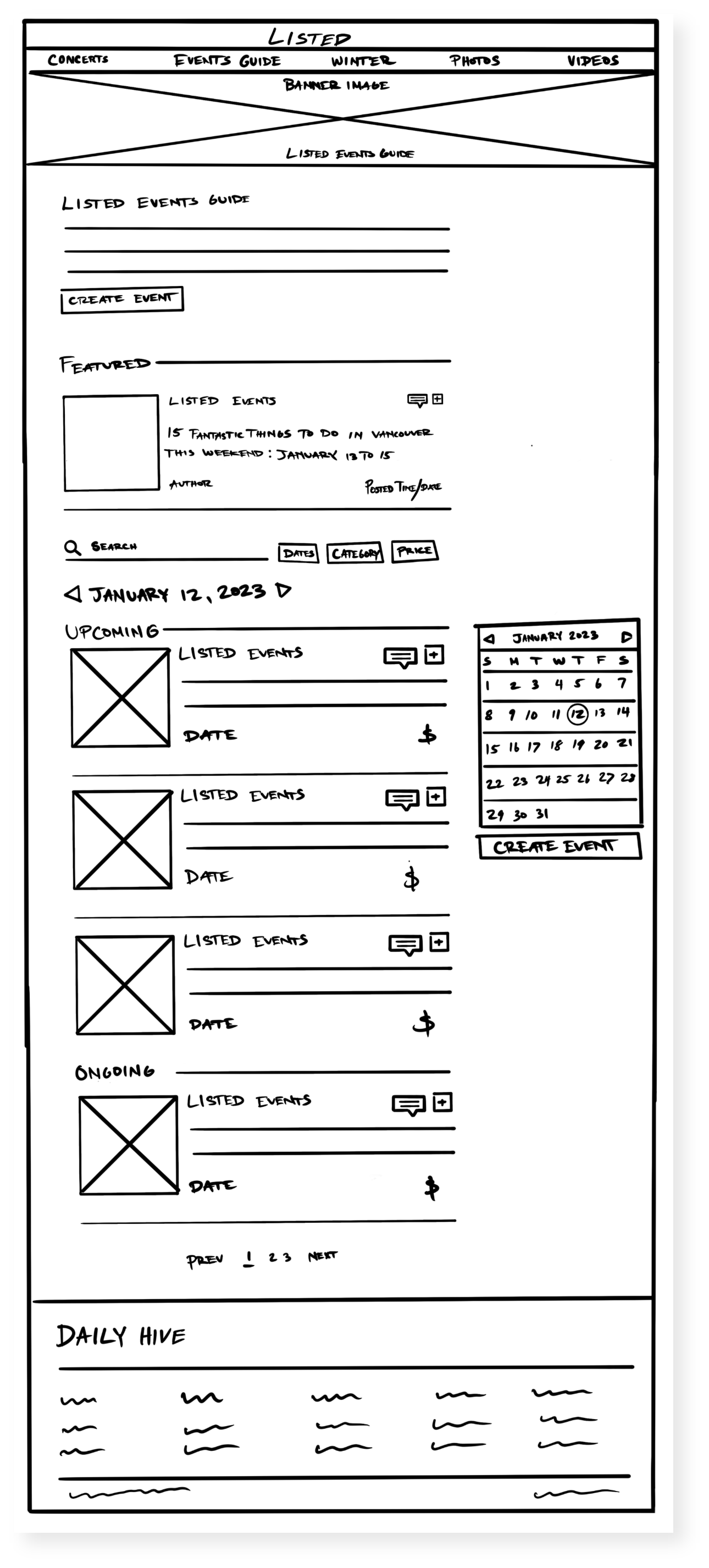
SKETCHES
After researching event websites, I began sketching and experimenting with various concepts to determine what could and couldn't work for the redesign.
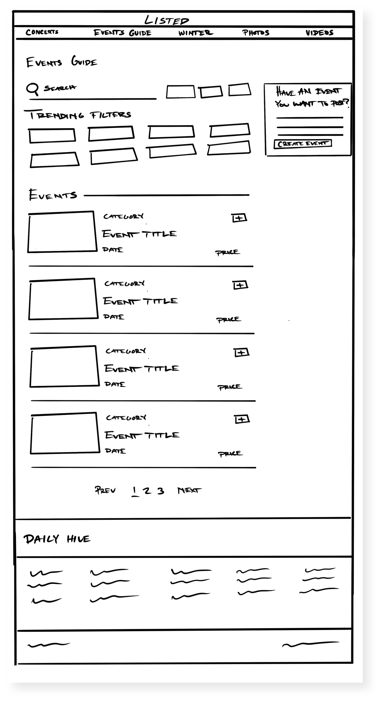
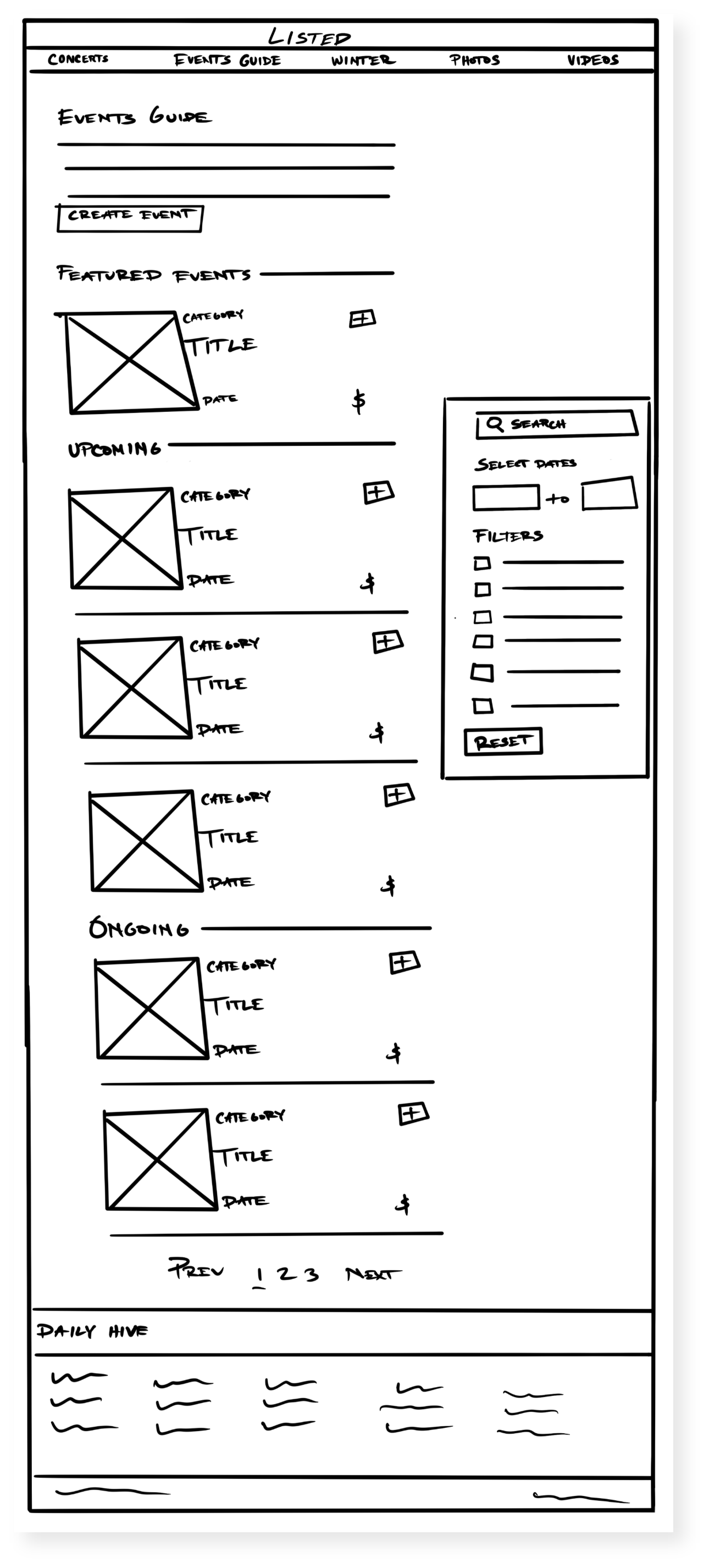
SEARCH BAR
To simplify the experience, I replaced the dropdown search bar with a regular search bar, allowing users to type in keywords or event names to generate maximum results.

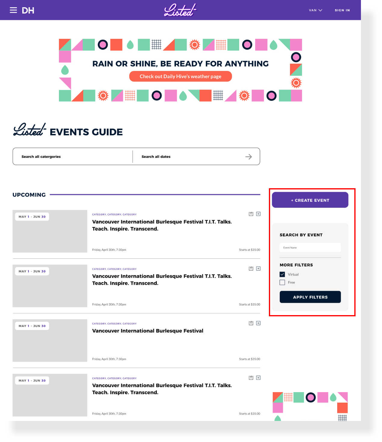
FILTER OPTIONS
To refine search results, I introduced category buttons, a calendar option, and an extensive list of filters.
FORM OVERHAUL
Finally, I redesigned the form section, recognizing it as the sales-driving component of the site. I ensured that back buttons were included at the top of the form for easy page navigation (1). Additionally, I added a status bar at the top of the form, indicating the current section of the form and making it clickable for additional navigation options (2). Finally, I placed a cancel form button at the bottom of each section, providing users with a straightforward option to exit the process (3).
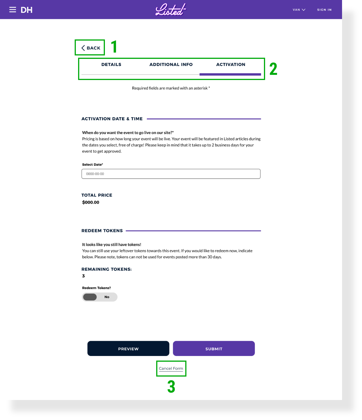
I also made sure to include error prompts to each section which would notify a user that they could not complete their form without filling out each section properly.


RESULTS & TAKEAWAYS
Since implementing the new redesign of the Events Guide, the site has seen a significant increase in the number of events being created in Vancouver (DailyHive's home base). Additionally, we have received positive feedback from users regarding the simplified event creation and search experiences.