
CARP X CAA
ABOUT
CAA is now the exclusive provider of the CARP Recommended Seal, offering users insurance coverage for Auto, Home, Life, Travel, and Pet needs.

CHALLENGE
Our objective was to craft an intuitive and responsive website that effectively highlights the partnership between CARP and CAA. While also showcasing the range of products and services, with a focus on driving users towards purchasing insurance packages.
APPROACH
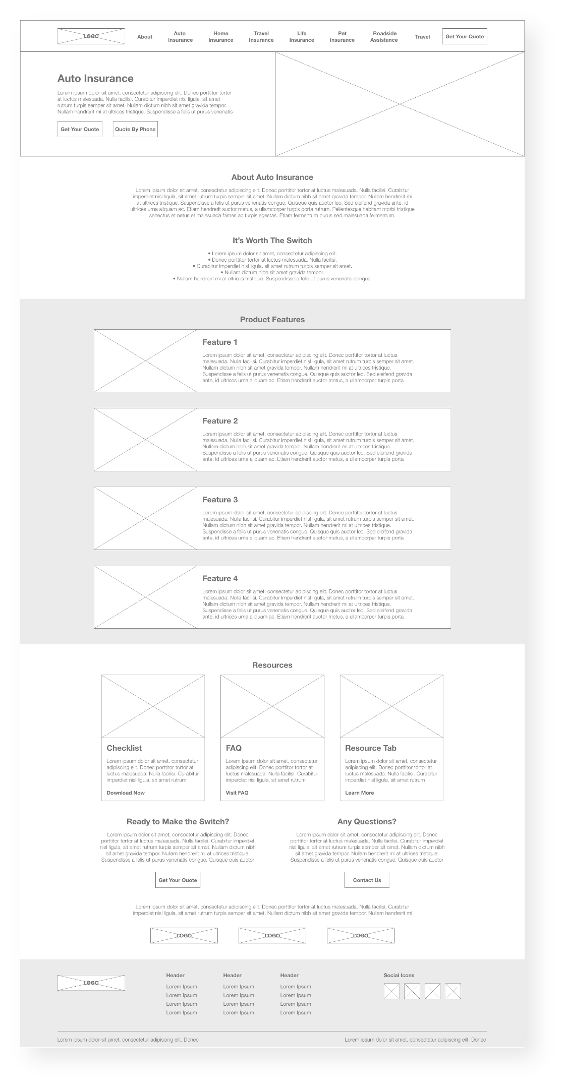
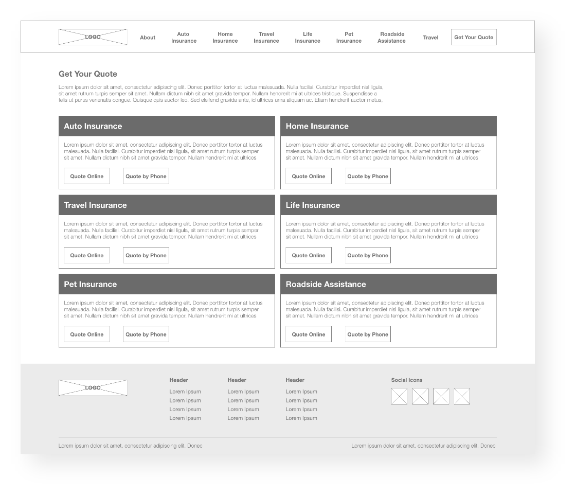
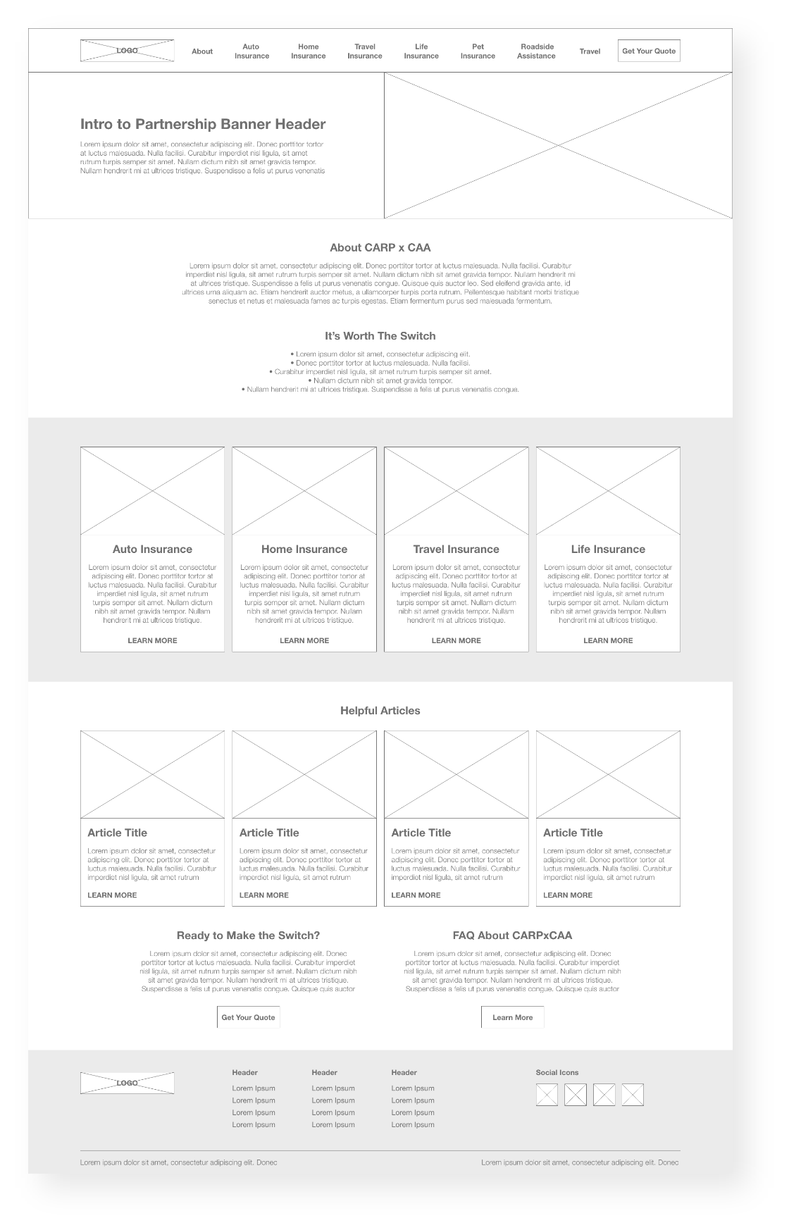
Given that the products featured on the site are CAA products, close collaboration with their team was essential to ensure the successful completion of our task. Following meetings with senior management and stakeholders at CAA to gain a comprehensive understanding of the website's pain points, I proceeded to develop greyscale wireframes. This approach enabled us to test preliminary designs, reach consensus on general direction, functionality, content blocks, and the overall structure of the website.


DESIGN DECISIONS
After the site's functionality and flow were approved, hi-fidelity designs were initiated.
BRANDING
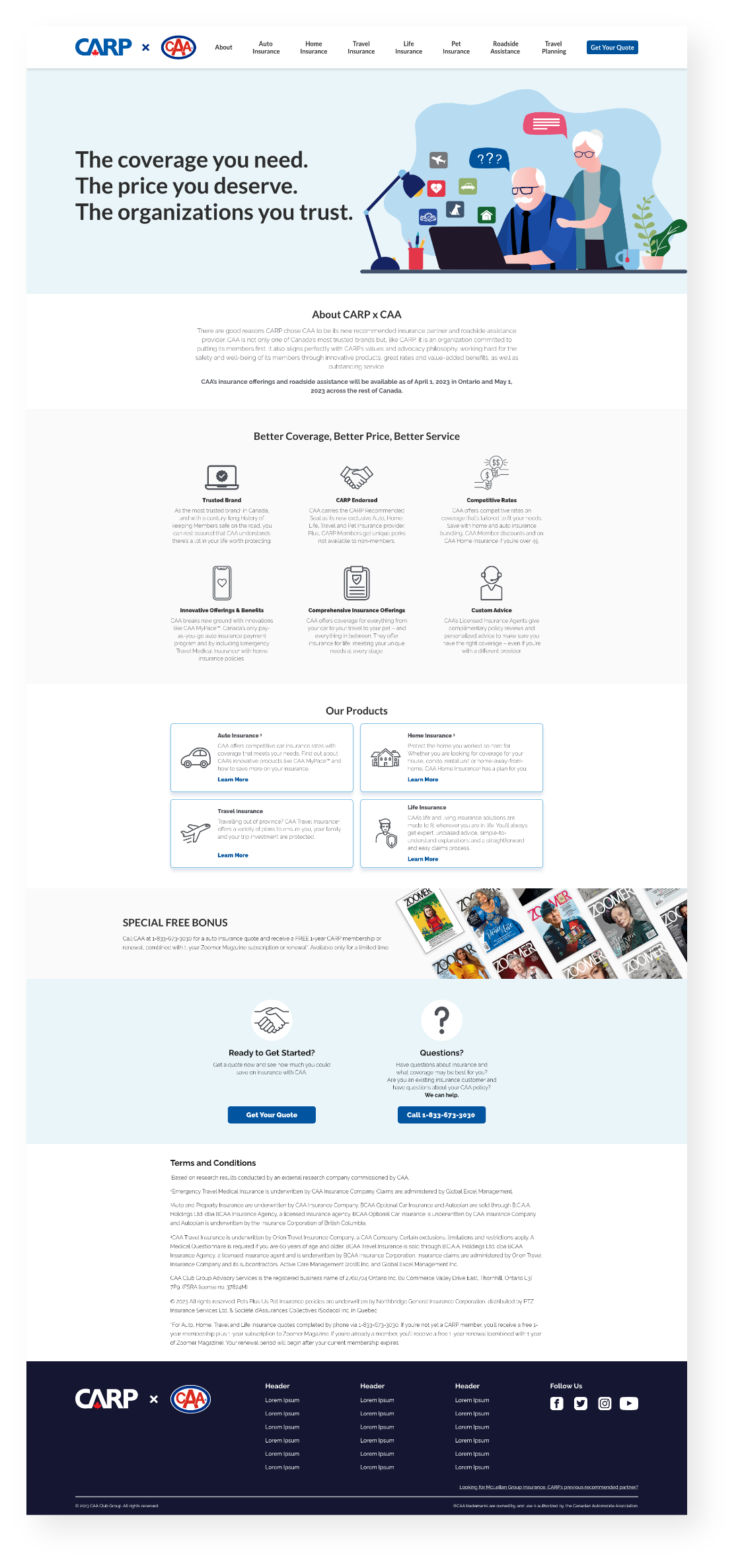
Both CARP and CAA have a distinct brand identity characterized by the use of blue, red, and white, as well as a clean and minimalist design aesthetic with ample white space. Given that this website represents a partnership between the two brands, it was imperative to maintain a consistent look and feel. I adhered to the branding colours and utilized neutral tones such as white, greys, and black. My aim was to create a site that is visually appealing yet not overwhelming, allowing users to easily navigate.

ACCESSIBILITY OPTIMIZATION
Given CARP's focus on an older, retired demographic, it was imperative that we optimized the user experience accordingly. To ensure accessibility and readability for all users, I adhered to WCAG contrast guidelines for all colours, and carefully selected font sizes and weights to enhance readability. Furthermore, we prioritized the optimization of mobile and tablet experiences to ensure accessibility across all platforms.


ILLUSTRATIONS
Given that the designs predominantly featured greys and whites, with blue serving as the accent colour, the pages appeared somewhat stark. To add a touch of colour and visual interest, I incorporated illustrations on each product page, which served both as a visual guide and a means to introduce colour to the predominantly white and grey palette of the site.

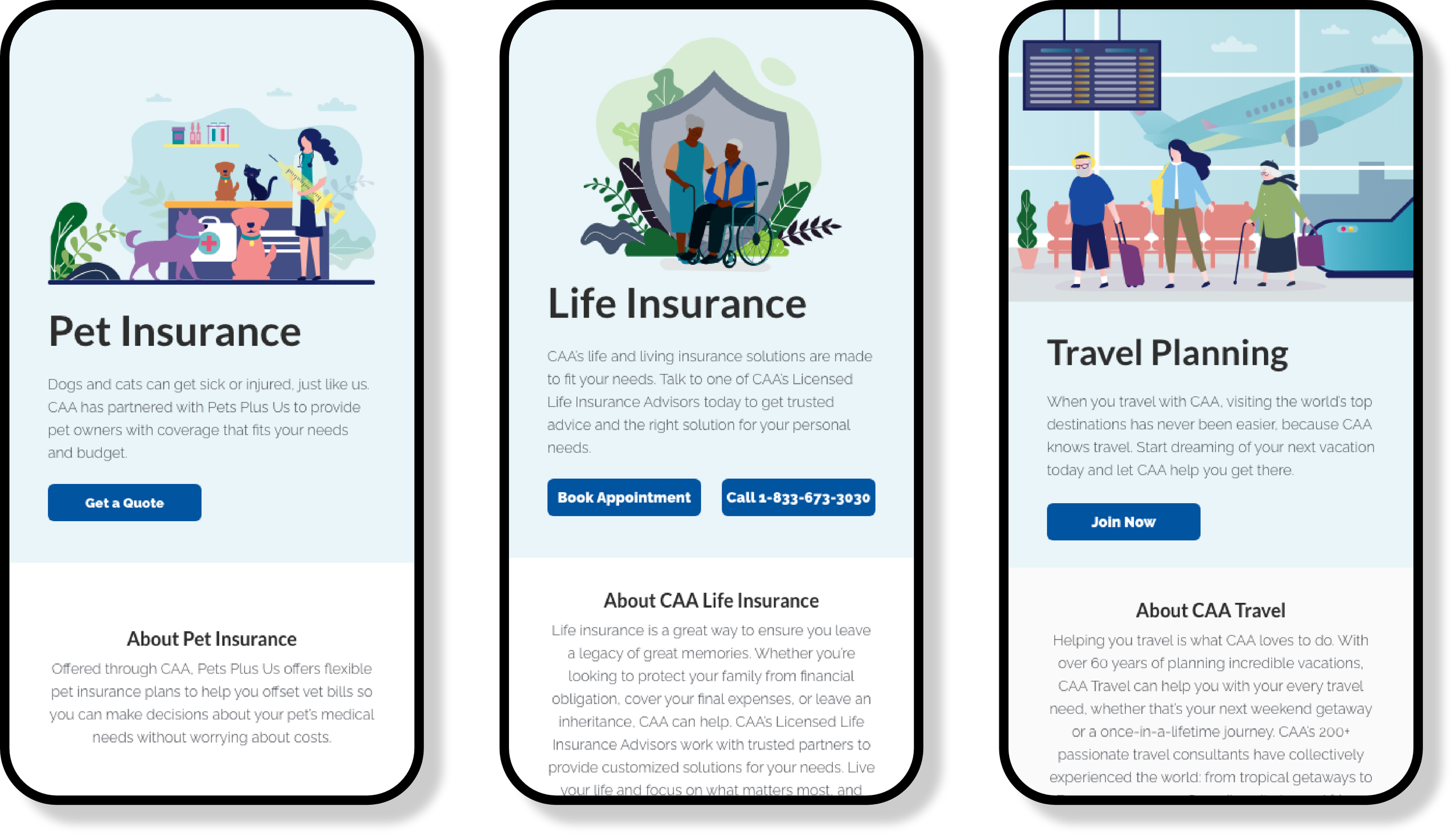
CALL TO ACTIONS
One of the primary objectives of the site is to channel traffic towards CAA's websites for the purchase of their partnered products. To this point, I integrated clear and compelling CTAs on each page, facilitating easy access for users to request a quote or contact CAA regarding their products at any time.


RESULTS & TAKEAWAYS
Since the launch of the revamped CARP x CAA site, we have observed a notable surge in the number of CARP members purchasing CAA products. Furthermore, we have received favourable feedback from our users regarding the streamlined user experience on the site. Additionally, CAA stakeholders have expressed their satisfaction with the final design outcomes and are excited to continue this new partnership.